R tutorial on accessing, filtering, aggregating and plotting data
This post offers a tutorial on how to access, filter, aggregate and plot the data in R. It will mainly covers following topics
- How to access a particular column or row from a dataframe?
- How to access rows with conditions?
- How to generate group wise statistics (e.g., salary statistics for male and female groups)?
- How to create new column in a dataframe?
- How to plot distribution of data?
- How to plot group-wise stats?
Pre-requisite
This tutorial requires you to have R-Studio installed on your system. In case if you don’t have R-Studio on your system, you can access it online by going to rstudio-cloud.
Installing required packages
Go to your R-Studio and execute following command
install.packages('rio')
install.packages('dplyr')
install.packages('lattice')
The above commands will install three pacakages (rio)[https://cran.r-project.org/web/packages/rio/vignettes/rio.html], (dplyr)[https://www.rdocumentation.org/packages/dplyr/versions/0.7.8], and (ggplot2)[https://ggplot2.tidyverse.org/]. We will use these packages in our tutorials.
Load a dataset into R-studio
In our first tutorial, we will learn how to load dataset into R-studio. For this tutorial, we will use a very simple dataset available here. This dataset contains four attributes (name, age, salary, expenses) (given below).
| name | age | salary | expenses |
|---|---|---|---|
| mac | 21 | 15000 | 600 |
| ravi | 25 | 18000 | 800 |
| david | 27 | 17000 | 600 |
| moorey | 43 | 33000 | 1200 |
| nolan | 33 | 24000 | 900 |
We can either use R-studio GUI or we can write code to load the dataset. So let’s say you have downloaded the dataset and saved it. You can write following codes to load the dataset into R.
# load the package
library(rio)

# open dataset file
# Specify your dataset filename with complete path
data <– import('filename')
Following is the demonstration of both ways for loading the dataset.
Access particular columns or rows from dataset
So we have loaded the dataset into R and now we want to access two attributes name and salary using dplyr package.
We will use following syntax
select(data_object,attr_name,attr_name,..)
OR
data_object %>% select(attr_name,attr_name,..)
Here, data_object is the object name you have used to load your dataset. You then specify the attributes name which you want to access.
In our case, we want to access name and salary. Therefore, we will specify these attributes in select().
library(dplyr)
library(rio)
# load dataset
dataset <- import('sample_data.csv')

# access name and salary attributes
dataset %>% select(name,salary)
Following is our code from R-Studio.

Similarly you can specify other attributes name which you want to access from your data. You can refer this link to get more information on usage of select().
Now, we will look at rows selection. Let’s say we want to fetch data of peple whose salary is higher than 20000.
We will use following syntax
filter(data_object,condition)
OR
data_object %>% filter(condition)
To fetch our data, we will use the condition salary > 20000. The snapshow below shows the result.

You can refer here for more information on filter() function. Following are some other examples
Accessing the last row
slice_tail(data_object)Accessing the first row
slice_head(data_object)Accessing row with minimum value of an attribute (e.g., who has the minimum salary)
slice_min(data_object, attr_name)Accessing row with maximum value of an attribute (e.g., who has the maximum salary)
slice_max(data_object, attr_name)
How to create new attributes using attribute from dataset?
We will take an example to understand this scenario. Let’s say we want to calculate the saving for each of the employee (from our salary dataset). So we want to have another attribute (saving) which will simply contains the amount of salary left after subtracting the expenses.
We will use mutate() function for this task. Following is the syntax
data_object %>% mutate(expr)
OR
mutate(data_object,expr)
Here expr means the expression that will be used to generate new attribute. In our case, the saving can be compute by subtracting expenses from salary. Therefore, expr is saving = salary - expenses.

Refer here for more detailed information on mutate() function.
How to generate group-wise statistics?
Whiile analyzing the dataset, we are often interested in group-wise statistics. For example, what is average salary for younger and older people or what is difference in sleeping hours in male and female.
To answer these question, we need to way to first group the dataset and then compute required statistics.
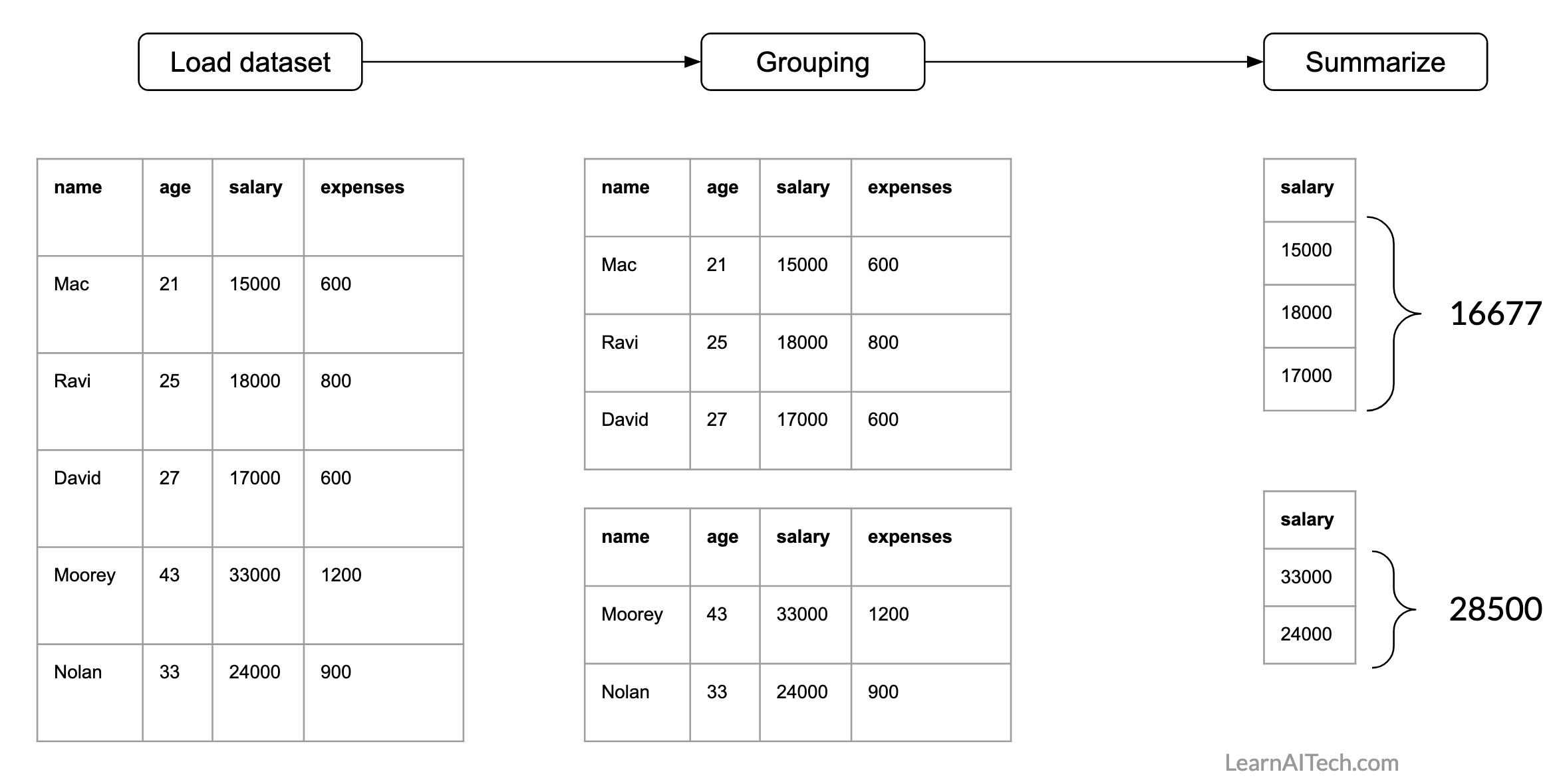
For our dataset, we can have this question: what is average salary of people who are younger and older than 30 years. So this we will use group_by() and summarise() functions from dplyr package.
Following is the representation of how the processing needs to be done.
In R, following is the syntax
data_object %>% group_by(attribute_name_used_for_grouping or condition) %>% summarize(statistics_you_need)here first we need to specify attribute which will be used for grouping and then we will specify what summary stats we need. Following are the options for summary stats
- mean(), median()
- sd(), IQR()
- min(), max()
- n()
For more details refer this
Now, let’s findout average salary of people who are younger and older than 30 years. So, here we need a condition for grouping. For example, if age < 30 then employee belongs to group-1 otherwise he/she belongs to group-2. Then we need to specify the attribute name for computing average.
Following is the illustration of finding group-wise average.

Now, we will do the same using R. For grouping we will use group_by() function. Here we need to specify the condition. Then we will summarise using summarise() function. Here we need to specify the statistics (e.g., mean, standard deviation, count) and the attribute/s name which will be used to compute statistics

Plotting the data
In this section, we will use lattice package from R to produce graphs. We will cover create following graphs
- Bar chart
- Box plot
- Density plot
- Histogram
- Scatter plot
You can use following syntax to create graphs using lattice package
graph_type(formula,data=)Here, graph_type is the name of graph which you want to plot. In formula, you need to specify what you want to plot. For example, if you want to plot a salary attribute from our dataset, you can write it as ~salary. If you want to plot two attributes (e.g., age and salary) then you can either write age~salary or salary~age.
Following table shows the graph_type for each of aforementioned graph
| graph_type | What it plots |
|---|---|
| barchart | bar chart |
| bwplot | boxplot |
| Densityplot | kernel density plot |
| histogram | histogram |
| xyplot | scatterplot matrix |
We will learn more about how to write these formuls in our examples.
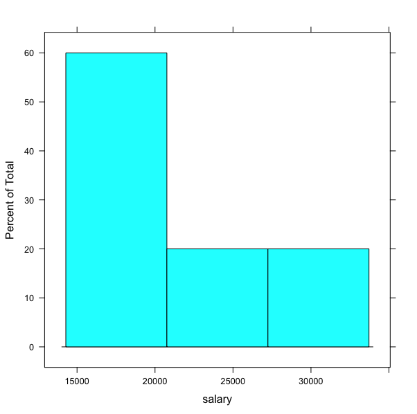
Let’s plot a histogram for salary attribute from our dataset. For this, we will use
histogramgraph type. We will specify the name of the attribute~salary.dataset <- import(your_file_name_path) histogram(~salary,data=dataset)


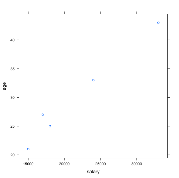
Now, we will plot the scatterplot for age and salary. We will use xyplot.
# You already have your dataset loaded in object dataset
xyplot(age~salary,data=dataset)
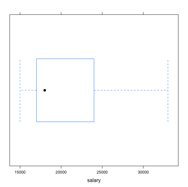
image-20210226180034354 Let’s plot a boxplot for salary attribute.
bwplot(~salary,data=dataset )
